
Warm and cool colors are not irreconcilable opposites, but chromatic worlds that work best when they interact with each other. The secret of perfect harmony? It’s all about knowing how to balance them.
When talking about warm and cool colors, the most common mistake is to consider them two separate worlds and use only one or the other. In fact, it is precisely when these two universes meet that interesting, dynamic and welcoming interiors come to life. Knowing how to combine them means creating balance, avoiding inexpressive or excessively charged areas. It’s a matter of color sensitivity and training, but you also need to be able to recognize the emotional power of colors and the impact they have on our mood and well-being.
Warm colors, like red, orange, yellow, terracotta, and all the shades of sun and earth, convey energy and a sense of welcome, which is why you might prefer them for convivial spaces. Cool colors, such as blue, gray, green, and purple, evoke calm and visual depth, making them perfect for areas dedicated to relaxation or concentration. The first thing you need to do, therefore, is fundamental: understand what emotions you want to evoke in your spaces.
Read also →
White Fair 2026 – Unmissable Textiles
What can you start from? From simple rules that help you listen to the space you live in, to bring its elements (colors, light, and materials) into dialogue and to achieve a harmonious, personal, timeless interior.
- The rule of dominant color: choose one protagonist color (warm or cool) and use the other as an accent. For example: the warm living room (beige, orange) is made cooler with touches of blue, sage green, and light blue; the bedroom, with its cool tones (gray, dusty pink, forest green), is warmed by wood, hints of ochre or blush pink, and copper details.
- The role of materials: wood, linen, terracotta, velvet, rope, brass are all warm materials. Metal, glass, marble, ceramic, stone are cold materials. In environments dominated by cool colors, the right materials can “warm up” the atmosphere and vice versa, just like colors would do.
- The power of light to alter the perception of colors: in dimly lit environments it is better to balance the cold colors with the predominant warm ones. In very bright rooms, cool colors help to rebalance.
- Mistakes to avoid: using only warm or only cold colors. Mixing too many different undertones (shades of the same color). Forget floors and large surfaces: a rug or a well-placed painting on the wall will do the trick.
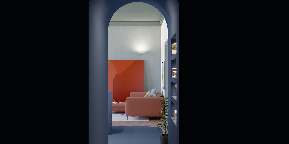
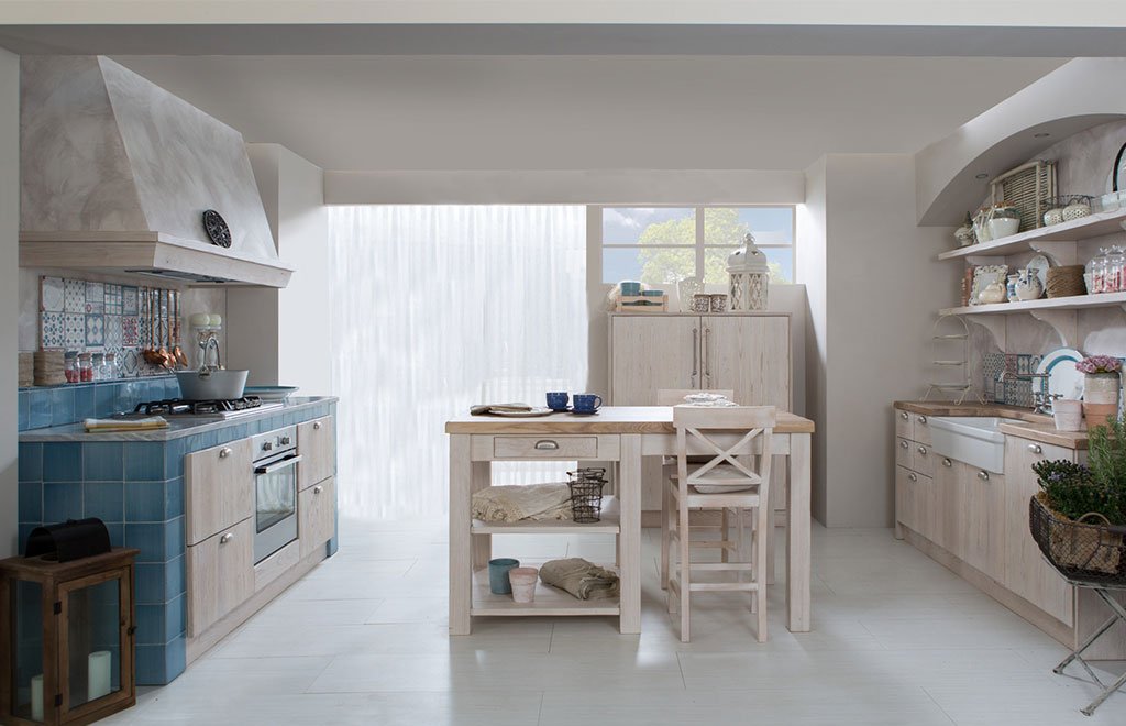
In the Milanese apartment renovated by Chromastudio, the clever mix of cool and warm tones punctuates and unifies the spaces beautifully, making it the perfect example of how to proceed. There’s no need to tear up the house, repaint the walls, or cover the floors with colored resin. If you’re renovating, that’s one thing, but if you just want to renovate, you really only need a few smart choices to give any room a new personality.
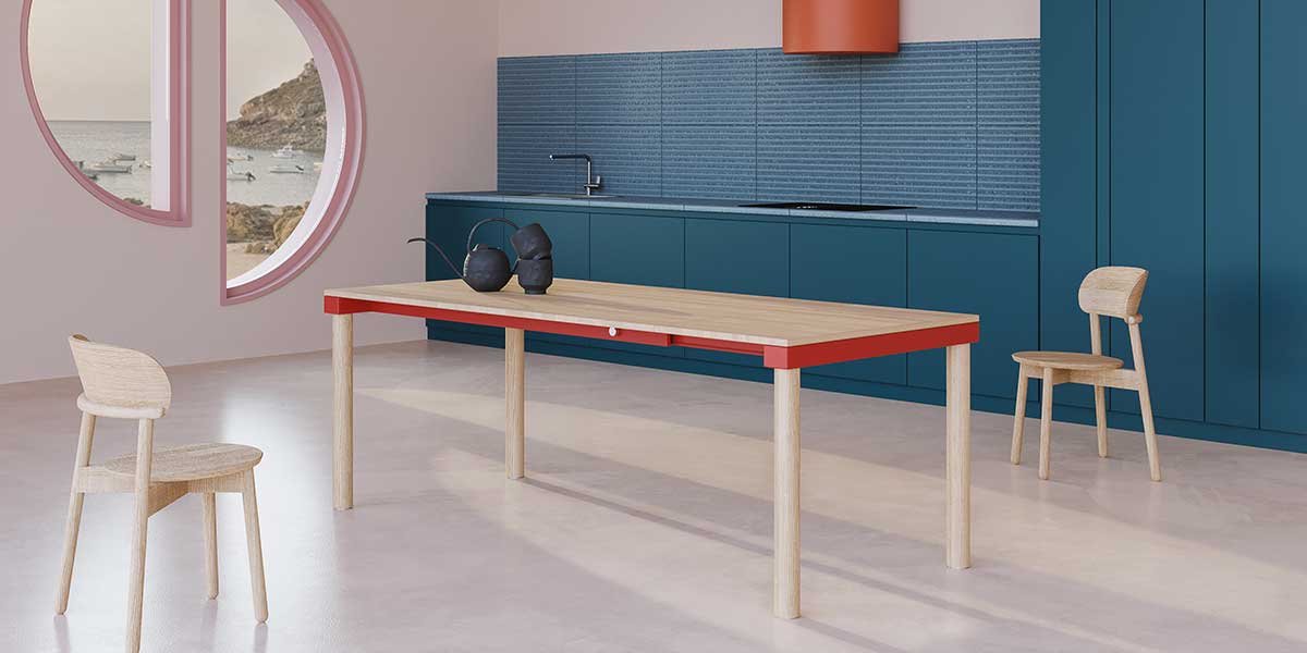
In convivial areas of the home, such as the living room, warm colors inspire welcome and liveliness.
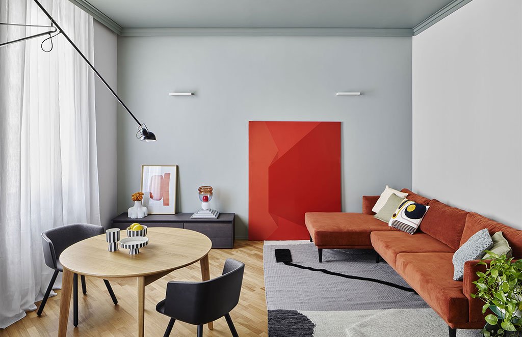
IDEAS FOR THE LIVING
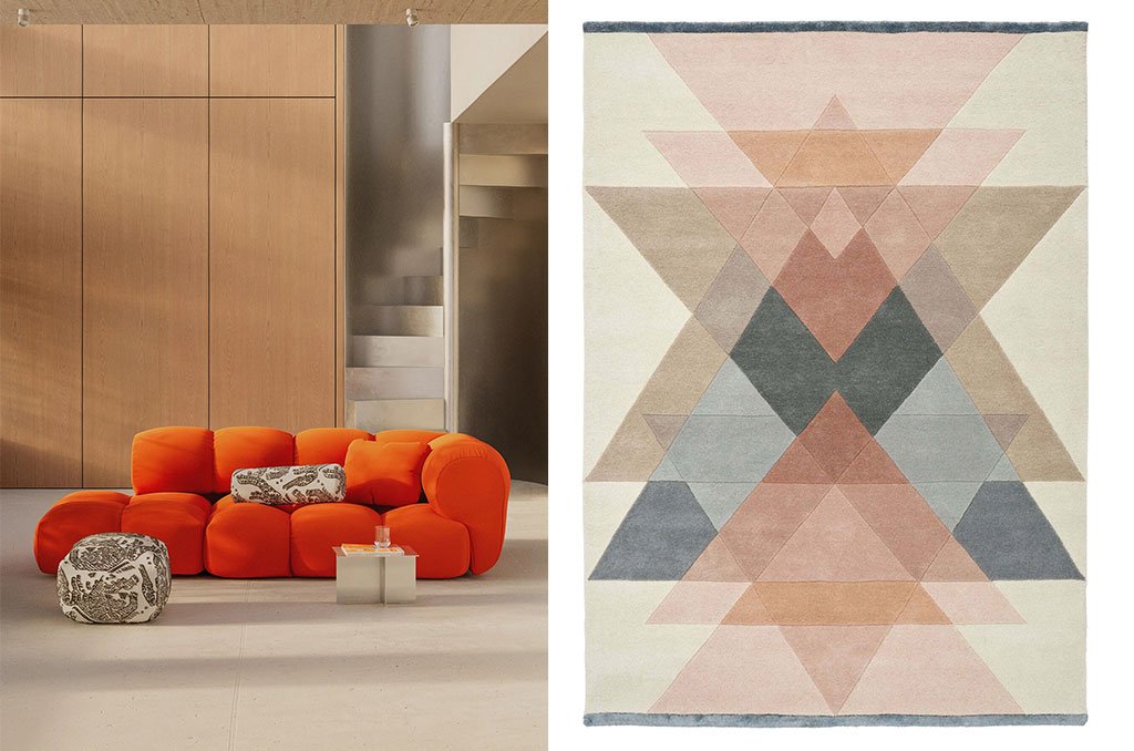
The living area of the Milanese apartment is the largest, the one that brings together and warms the atmosphere of chatter, laughter, games, and stories. Chromastudio chose sienna as the dominant color for the large sofa, toned down by a light-colored rug and an alternation of elements in bright and cool tones, creating a balanced vision and a welcoming space.
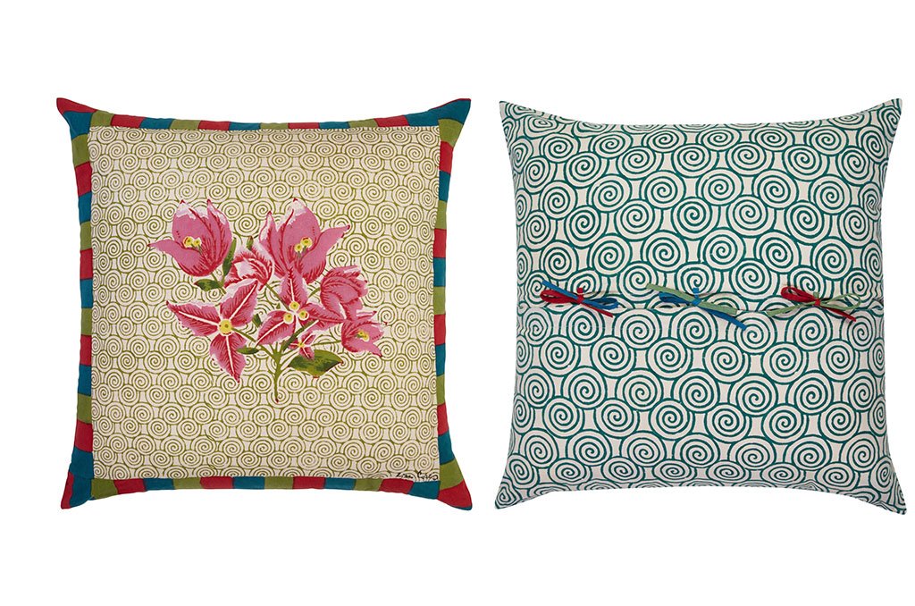
Your showpiece could be the Sander Sofa by Out, a soft orange sofa designed like a marshmallow you can sink into and fill with cushions. I chose colorful ones, perfect whether you prefer a sofa in cool, warm, or neutral colors. The Bouganville Spiral model by issimo x Lisa Corti is made of pure cotton and, while on one side it boasts pink flowers and a multicolored checkered trim, on the other it is tied with romantic bows.
The shades chosen to characterize the living area are all summarized in the Freya rug by Linie Design, with geometries inspired by Art Deco and Scandinavian design. In lana e viscosa lavorate artigianalmente, con le sue nuance delicate crea un equilibrio raffinato tra l’espressione giocosa e minimalista e quindi ben si adatta ad ambienti dominati sia da colori caldi, sia freddi.
On the left, two-seater modular sofa, Sander Sofa by Out, 255x115x74h cm design 05, €6,050 – objekteunserertage.com. On the right, Freya carpet by Linie Design, design Hanne Kortegaard, 250×350 cm, €1,940- liniedesign.com
Bouganville Spiral Cushion by Lisa Corti, 60×60 cm, €95 – lisacorti.com
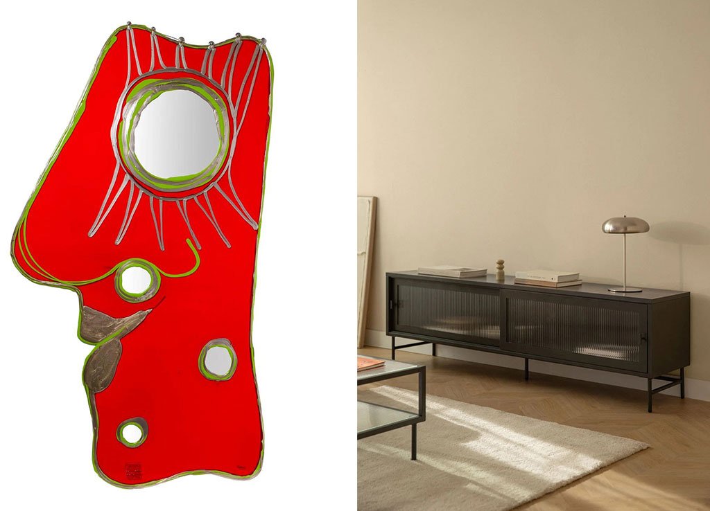
Materials, as well as colors, can be warm or cold and help harmonize the environment.
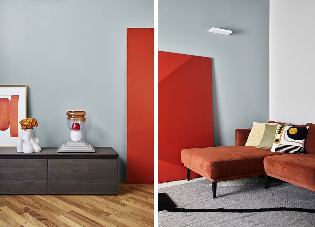
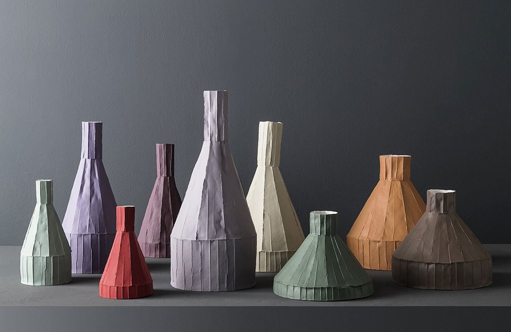
The warm tones that dominate the living area of the Milan apartment are calmed by a dark piece of furniture and glass vases. You can choose a metal TV stand like Paoline by Sklum, made of steel and translucent glass: modern and sophisticated at the right level. Above, you can place vases which, like the carpet, concentrate warm and cool tones, creating a harmonious palette. Paola Paronetto’s Etna and Vesuvius creations are inspired by volcanoes, giving life to a colorful family of vases in paper clay, a special mixture of ceramic and cellulose: changeable, superb, but always ready to welcome a flower.
If you want to keep your walls white or neutral, consider decorating them with paintings, mirrors, and prints. In questo modo prenderanno parte al dialogo cromatico, bilanciando gli spazi. The Look at me resin mirror by Fish Design by Gaetano Pesce, designed in 2004 and still handcrafted to order by Corsi, is a colorful masterpiece. It resembles the profile of a face, complete with a large mirrored eye and is available in various sizes and shades. If you choose the XL size, you will transform your living room into an art gallery.
On the right, Paoline low cabinet by Sklum, 180x40x55h cm, €229.95 – sklum.com. On the left, Look at me mirror by Fish Design by Gaetano Pesce, from €297.68 for size XS (43×26 cm) to €1,300.52 for size XL (140×75 cm) — corsidesign.it
Etna (the tallest) and Vesuvius (the shortest) vases by Paola Paronetto, various sizes, from €760 – paolaparonetto.com
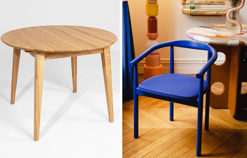
The open-plan area that connects the living room and kitchen is occupied by the dining table, which in the apartment renovated by Chromastudio is simple, made of light wood, surrounded by dark chairs. A striking combination that you can recreate with Sun by Avaredo, a round extendable dining table in natural solid oak, and with the Contour Bleu chairs by Colortherapis, also in solid oak but in a vibrant royal blue shade.
A righe bianche e nere, le ceramiche sul tavolo sono adatte a smorzare la tensione caldo/freddo senza però smettere di ipnotizzare lo sguardo. The striped place setting from the Toppu collection by Oyoy Living Design is made of stoneware, handcrafted and hand-painted by a team of women with great precision and patience.
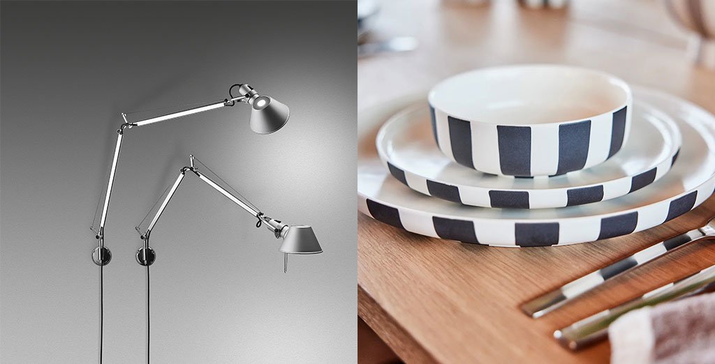
The light that illuminates the dining area comes from an iconic lamp, the same one found in every room of the house. It’s an interesting idea to copy, that of unifying spaces through the same light points, especially if they are design creations of a certain importance. Try the Tolomeo wall lamp by Michele De Lucchi and Giancarlo Fassina for Artemide, created in 1987: it has articulated aluminum arms adjustable in height and tilt and a head that can be rotated in any direction. Even today it is a work of minimalist and sophisticated genius.
On the left, Sun table by Avaredo, 90/120x90x75h cm, €659; 100/140x100x75h cm, €756; 110/160x110x75h cm, €869 – avaredo.com. On the right, Contour Bleu chair by Colortherapis, 50x44x73.5h cm, €429 – colortherapis.com
On the left, Tolomeo Parete lamp by Michele De Lucchi and Giancarlo Fassina for Artemide, length 81/126 cm; height 67/131 cm, from €230 – artemide.com. On the right, Toppu place setting by Oyoy Living Design, large serving plate (ø26.5 cm, €66.95), small dinner plate (ø20 cm, €40.95) and bowl (ø13 cm, €30.95; ø20 cm, €66.95) – oyoylivingdesign.com
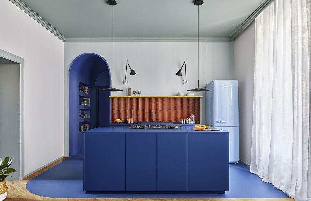
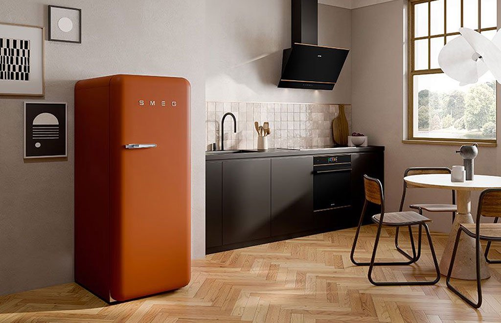
In a cool, blue-toned kitchen, you can add warm accents with your choice of tiles or large appliances. Dare!
IDEAS FOR THE KITCHEN
The same rules apply in this room: if you decide that the dominant color is cold, use warm accents. For example, a kitchen like the Rosemary model by Aurora 1947, handcrafted in solid brushed chestnut in a natural and light blue color (embellished with glazed Salerno terracotta ceramics by Giovanni Demaio), should be warmed up with pieces in warm hues.
Tiles behind countertops and sinks, the refrigerator, or other elements of your choice can serve this purpose, adding a harmonious ambiance. Mutina’s Rombini is a special three-dimensional porcelain stoneware covering with a striking chromatic impact that serves precisely this purpose. The result of a complex project, it allows you to create embossed surfaces in both a matt and a recent glossy version in various colours: here, to contrast with the cold blue, I chose the “brun” shade, which is the same one used by Chromastudio.
Il frigo selezionato dagli architetti nell’appartamento milanese, invece, è azzurro. You can maintain an undertone of the kitchen’s dominant color or incorporate a warm orange hue. Smeg, in this case, with its iconic Fab28 single-door freestanding refrigerator, offers a wide palette (the latest models are also elegantly matte) and an irresistible rounded 1950s design that adapts to any style. The rust-colored version is truly visually striking.
The Rosemary kitchen by Aurora 1947, the complete model starting from €18,000 – auroracucine.it
Rombini Triangle Small Glossy Brun wall covering by Mutina, designed by Ronan & Erwan Bouroullec, approximately €746 per m²- mutina.it
Smeg Fab28 refrigerator in Rust Matt, 60.1 x 72.8 x 153 cm, €2,099 – smeg.com
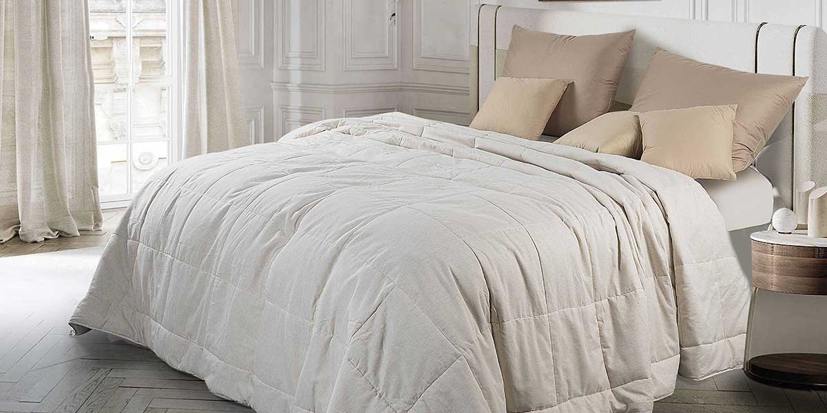
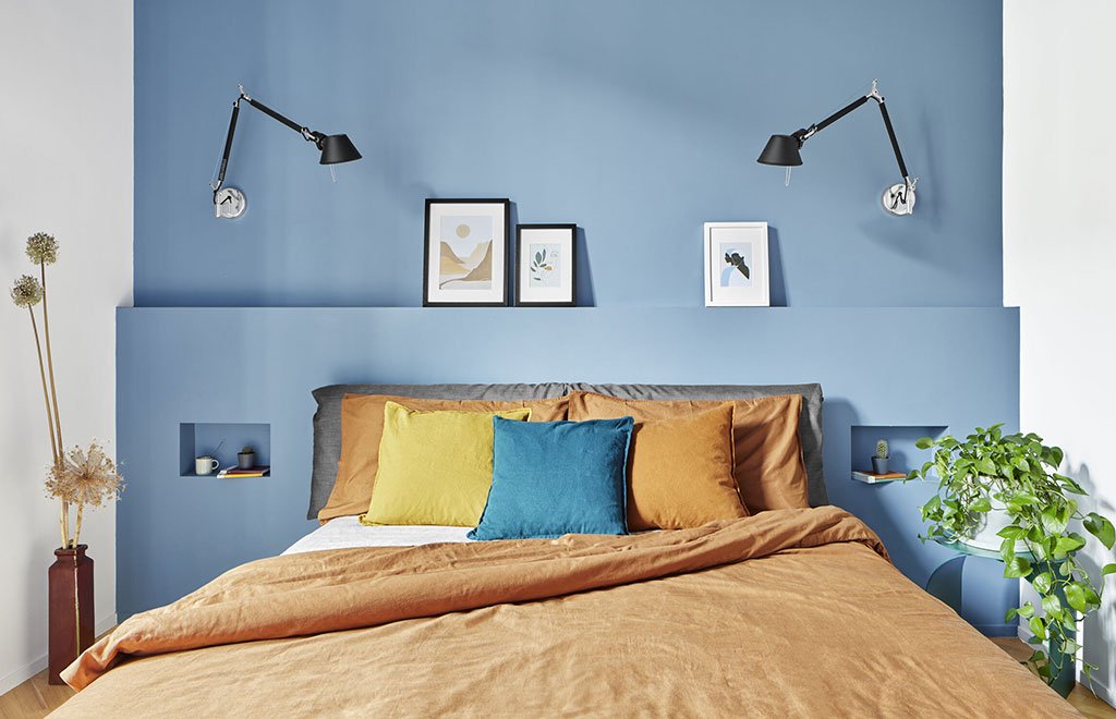
Light blue, blue, green, and all the cool shades make the bedroom an extremely relaxing place, as long as they are toned down with small forays into warm hues.
IDEAS FOR THE SLEEPING AREA
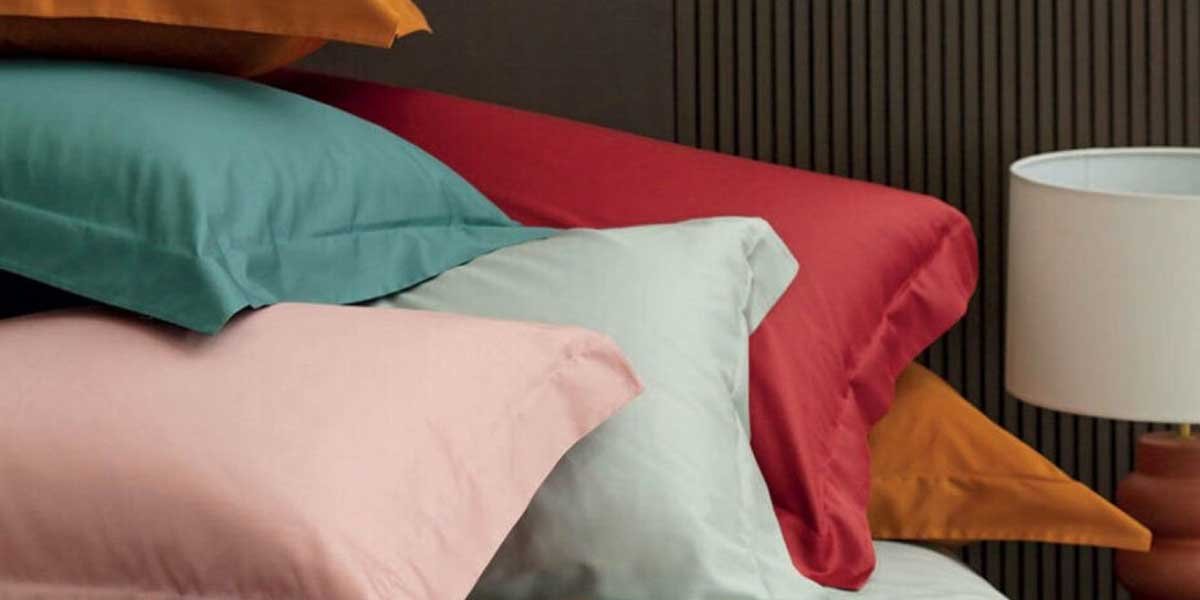
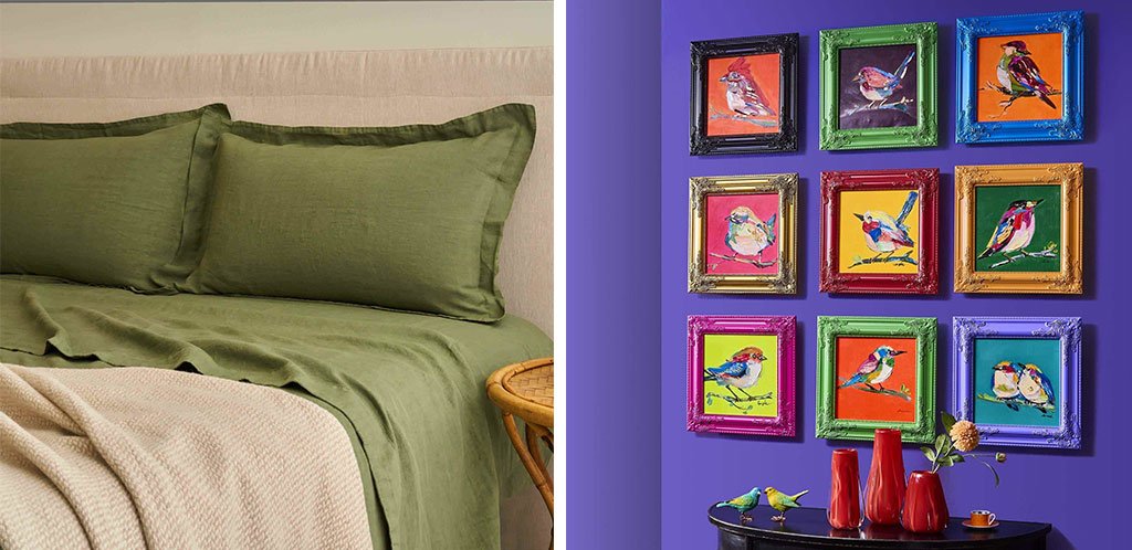
While warm colors are preferable in the living areas of the home, cool tones inspire calm and serenity in the bedrooms. White, light blue, light grey and sage green walls provide the backdrop for a relaxing sleep, as long as they share the scene with hints of warm shades. You can play with the bedding: if the dominant color is cold, use pillows or blankets in warm shades.
Here I propose the Hamilton double bed set by Biancoperla in garment-dyed linen, a special technique that enhances the natural beauty of the fabric, making it soft, comfortable, with a wrinkled and lived-in feel. It is made in Italy according to the Tuscan artisan textile tradition and, what’s more, you can choose yours from 12 colors. This is forest green, warmed by Biancoperla’s York blanket in wool and alpaca, in a natural shade.
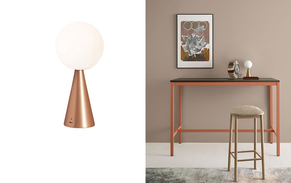
On the bedside tables you can place the Bilia Mini Portable lamp by FontanaArte, the portable and rechargeable version of the iconic lamp designed by Gio Ponti in 1932, with an opal blown glass sphere and metal cone. A design classic that today evolves thanks to wireless technology (you can take it wherever you need it) and new finishes. The ideal versions for a cool-toned bedroom? Quelle in ottone e in rame! You can instead balance a cold wall by using warm-toned frames, like the baroque one by Werns. The great thing is that it’s made of wood and has a classic design, but it shows off ultra-pop colors.
On the left, Hamilton double bed set by Biancoperla (top sheet 250×290 cm, fitted sheet 180x200x30 cm, pillowcases 50×80 cm), €456 and York plaid by Biancoperla, 150×200 cm, €189 – biancoperlaitaly.it. On the right, baroque frame by Werns, 42×42 cm, €49- hi-werns.com
FontanaArte’s Bilia Mini Portable Lamp, ø 12x26h cm, approximately €319 – fontanaarte.com
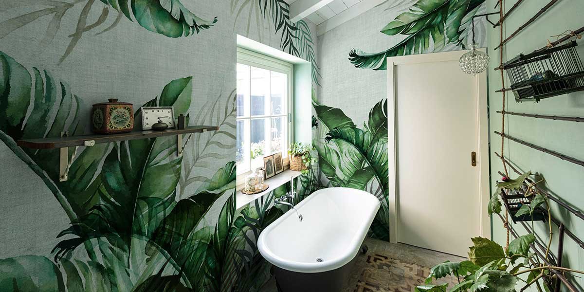
Alternating warm and cool tones also helps optimize and enhance smaller spaces like the bathroom.
IDEAS FOR THE BATHROOM
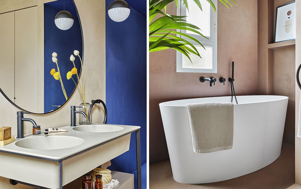
In the bathroom, it’s best to choose light colors, which can visually open up a small space, along with mirrors and adequate lighting. In the Milanese apartment, three colors alternate: blue, ivory, and pale pink. If you don’t have colored walls, use details and textiles to create warm/cool color plays. Choose your dominant color (for the bathroom, it’s best to opt for cool tones, which inspire visual cleanliness and freshness) and then have fun choosing accents.
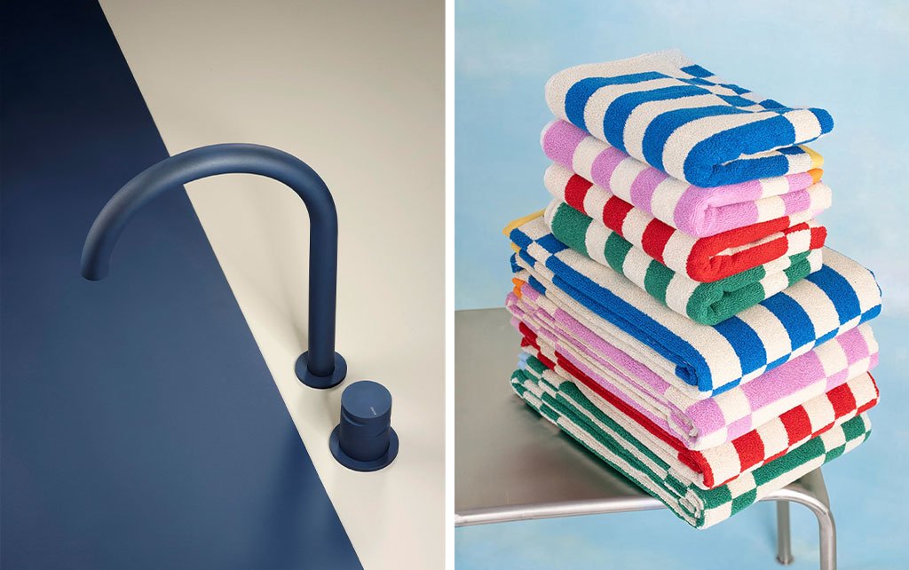
Look for colorful faucets, like the Giotto mixer by Mina, in stainless steel with CeraMINA, an exclusive ceramic color finish with pearlescent shades, and opt for spectacular sponges, like the multicolored pack by Tarta Gelatina consisting of 4 bath towels and 4 hand towels in Oeko-Tex certified organic cotton, allowing you to choose the color that best suits your bathroom every day. And to your mood.
On the left, Giotto 2-hole countertop mixer by Mina in Sweet Blue, from €794- minainox.com. On the right, set of 4 bath towels (140×70 cm) and 4 hand towels (70×50 cm) by Tarta Gelatina, €225- tartagelatina.com
Project by Chromastudio Interior Designers
Photo © Riccardo Gasperoni
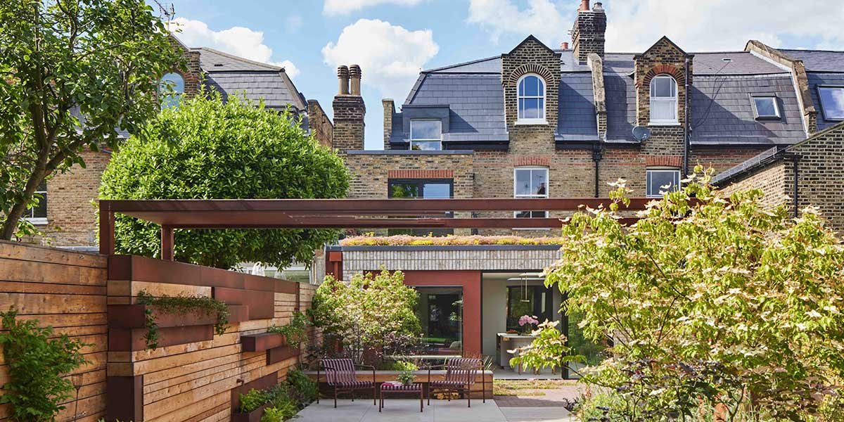
The cover features a charming glimpse of the living area of the Milanese apartment, where warm and cool tones coexist in perfect balance.