
Between dramatic velvets, unexpected palettes, and British references, the festive table setting becomes cultured and personal, abandoning minimalism and rediscovering the pleasure of tableware conceived as an aesthetic gesture, capable of telling stories and creating atmosphere.
The 2025 holiday table definitively abandons the obvious and allows itself a cultured, almost narrative lightness, where each element dialogues with the other without ever raising its voice. It’s a visual story that discreetly looks to spring, mixing hints of yesteryear with contemporary accents, made of dusty colors, metallic reflections, and bold textures.
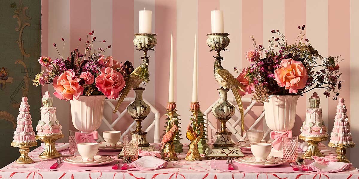
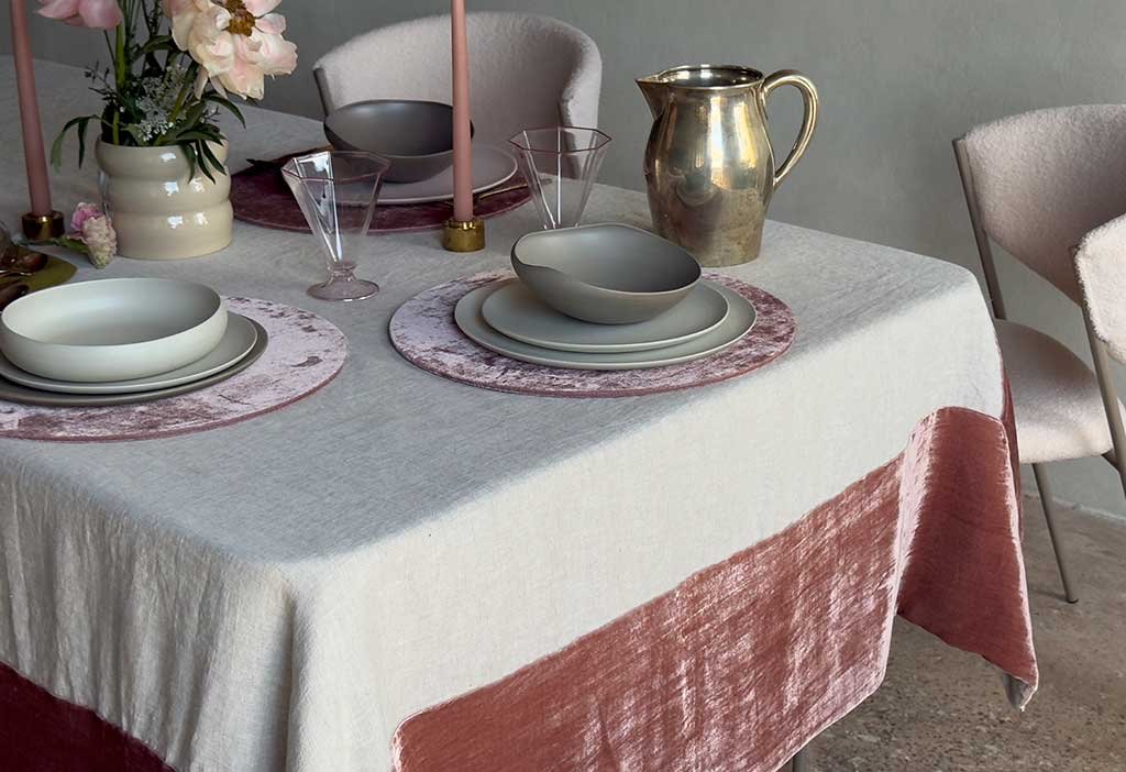
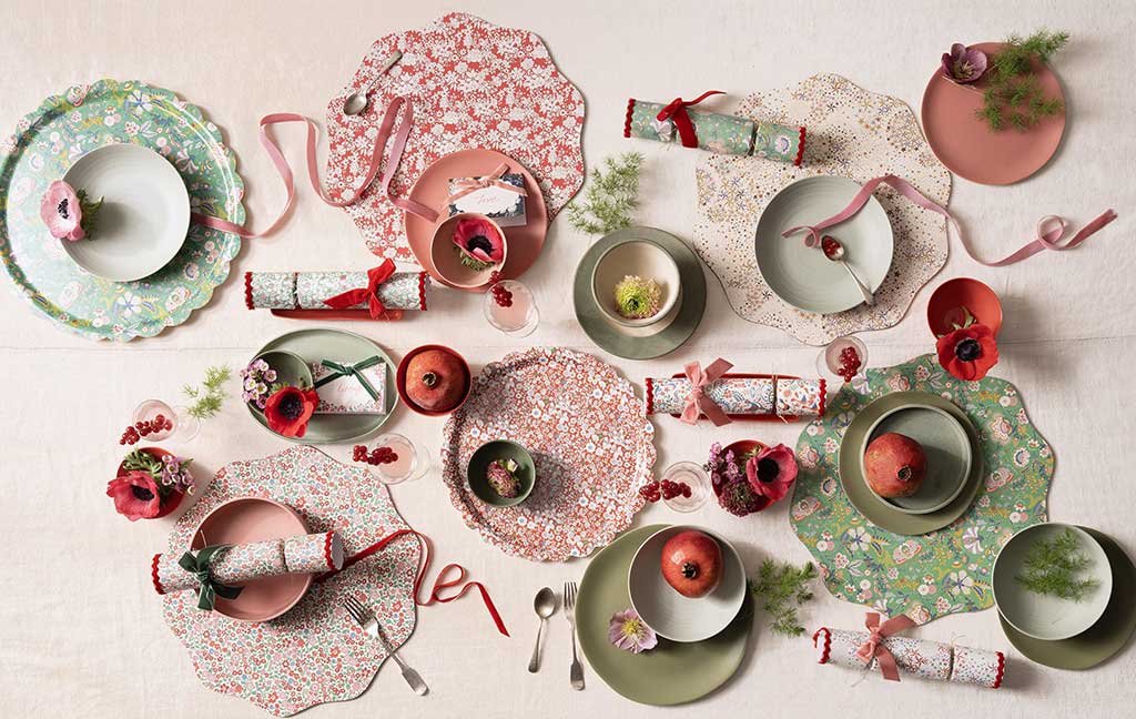
Once Milano’s Vintage Pink Collection – oncemilano.com
Once Milano’s Vintage Pink Collection – oncemilano.com
This new language of tableware is defined by a few key elements, chosen with awareness and never out of habit:
- Precious textures, from textured linen to the most dramatic velvets, capable of giving depth and character.
- Unconventional shades, where antique pink, sage green, and sugar paper interact with accents of deep blue and incursions of black.
- Expressive ceramics, decorated, glazed or enriched with metallic details, far from any neutrality.
- Cutlery and glasses designed as true accessories: dark finishes, brass or gold for the former, only clear glass and crystal for the latter.
- Balanced decorative elements, including floral arrangements and luminous details that capture the light without ever weighing it down.
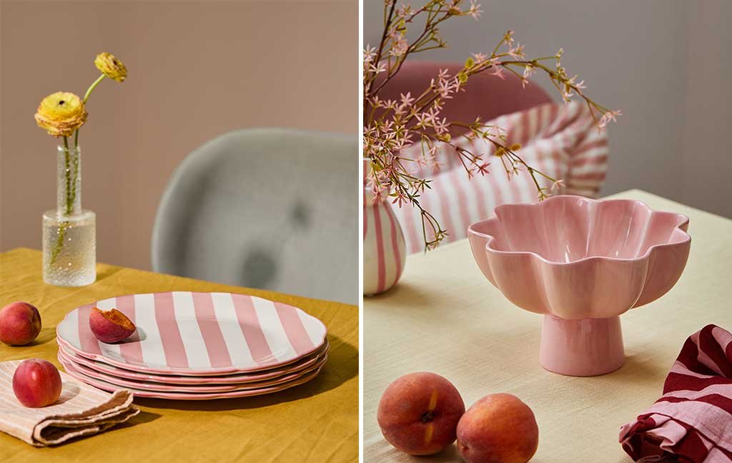
On the left, Florence collection plates; on the right, Pink Petals bowl, all by Rose & Gray – roseandgrey.co.uk
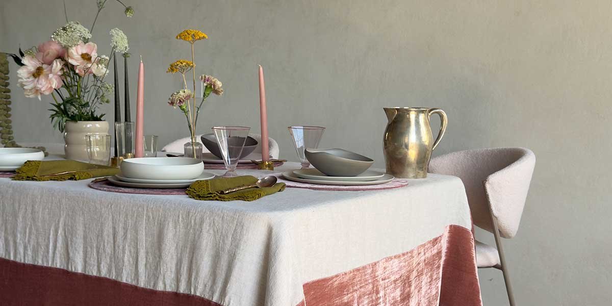
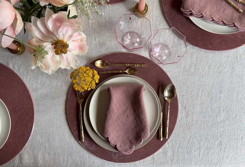
The color palette is already forward-looking, with a clear preference for dusty pink, a shade we’ll continue to see in 2026 and which is now establishing itself as a new emotional neutral. It’s a color that works because it warms without being overpowering, especially when balanced with touches of gold and silver, capable of reflecting light and creating rhythm. Flowers remain essential, whether fresh or dried, as long as they’re of the highest quality. Personally, I love them both, but I’m adamant on one point: if they’re not beautiful, it’s best to avoid them. The “graveyard” effect is always just around the corner.
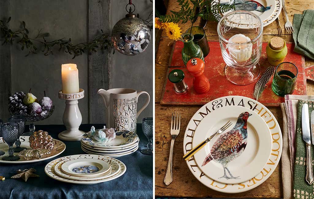
Gold Toast Collection by Emma Bridgewater – emmabridgewater.co.uk
Read also →
Christmas table – enchantment and splendor
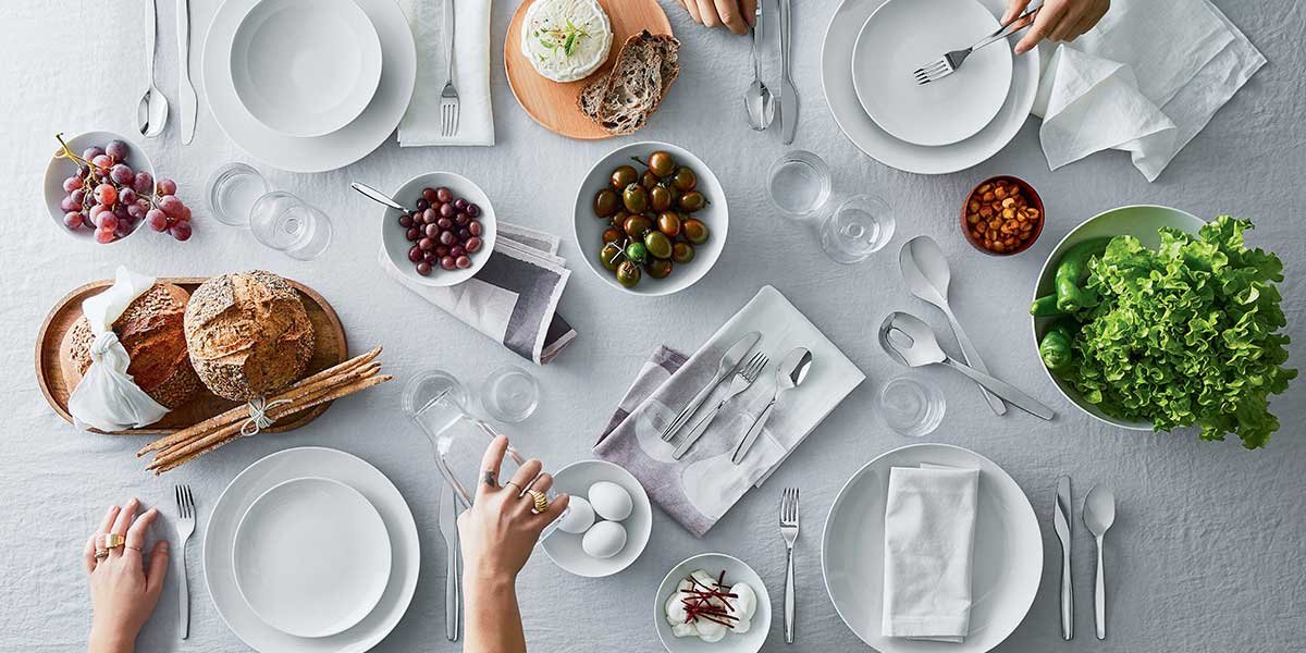
THE POWER OF TEXTILES
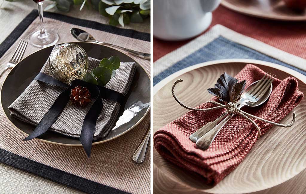
When I think of a festive table setting, I always start with the fabrics. They set the mood. Linen remains a must-have, but velvet is making a real comeback: captivating and dramatic, yet decidedly challenging. It’s a choice for the bravest, I know, but the result is well worth it. Tablecloths take center stage, prominent and textured, and are often enhanced with placemats or placemats, layered to create movement. I love using them in contrast, but also in tone-on-tone for a more subtle elegance.
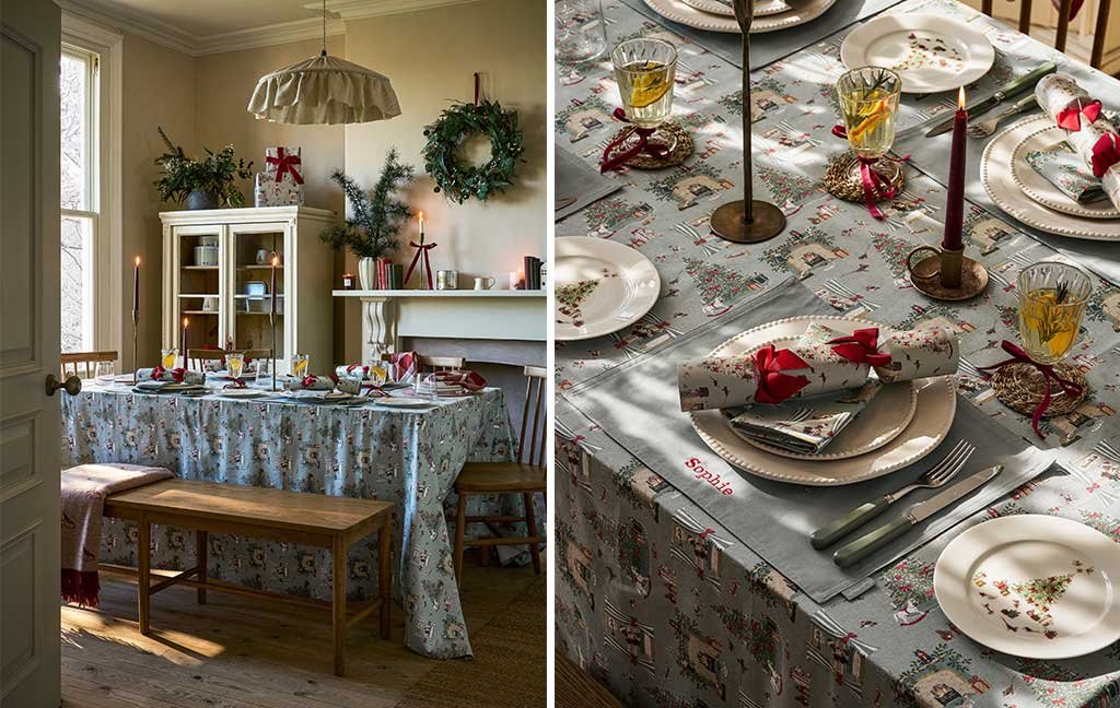
Christmas table setting by Sophie Allport – sophieallport.com
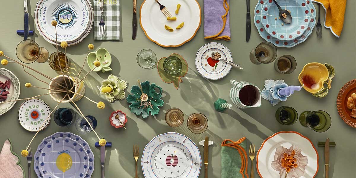
Colors deserve a special mention. I truly encourage you to step out of your comfort zone: pink and sage green are a refined and contemporary combination, but I also find the inclusion of baby blue, midnight blue, or black, used with care, very interesting. Total white has become devoid of personality. A table must tell a story, not simply be correct.
Meri Meri x Liberty Christmas Tableware – merimeri.co.uk
CERAMICS AND PERSONALITY
Dishes follow the same philosophy. I choose them with character, rich, decorated, perhaps with gold details, or in a monochrome version in pink shades that herald the warmer months. Alternatively, thematic patterns or soft green nuances work very well. The advice is always the same: let your personal taste guide you, without being afraid to be bold. A successful table setting is never born from shyness.
Christmas table designed with Perth textile by Ian Mankin – ianmankin.co.uk
CUTLERY, GLASSES & CO.
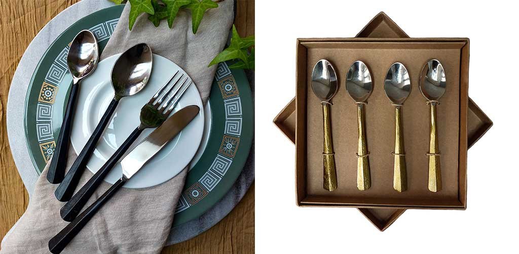
As for cutlery, I would always opt for silverware. It has a timeless appeal, a quiet yet authoritative presence. However, not everyone has a complete set, and this is where smart alternatives come in: steel with dark handles, somewhere between blue and black—shades that shouldn’t be mixed, however—or gold finishes, preferably with a handmade touch that makes them less industrial.
Left, handmade flatware from the Rajni Rustic Carbon Black collection; right, handmade flatware from Abha Rustic Gold, all by Anav – anav.co.uk
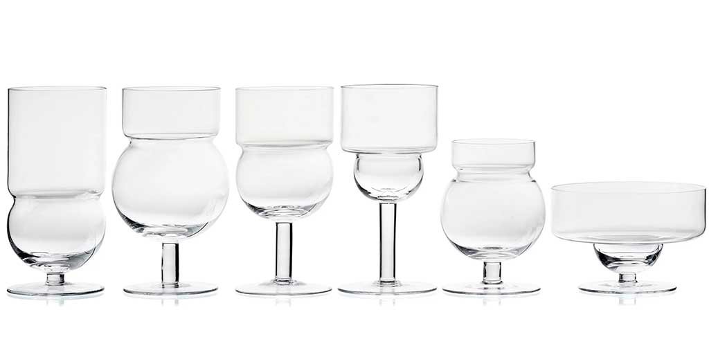
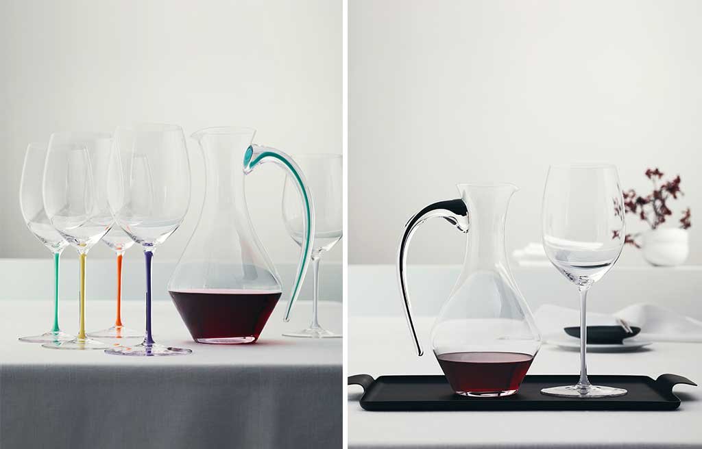
Glasses must be impeccable in their simplicity. Crystal or white glass remain irreplaceable, but this doesn’t exclude the possibility of choosing unusual shapes that add personality without weighing them down. As a conceptual counterpart, I love including imposing decanters, especially for special wines: handmade ones become true pieces to be admired as a plus.
Glasses from the Sferico collection by Karakter, designed by Joe Colombo- karakter-copenhagen.com
The décor is the final piece, perhaps the most delicate. It must surprise without ever being exaggerated. In addition to flowers, I never forgo serving trays, which I find essential both aesthetically and functionally. Silver remains unbeatable—grandmothers’ trays are among the chicest objects you can bring to the table—but even the more contemporary gold versions are beautiful, perfect for adding a touch of sparkle to the overall look.
Riedel Fatto a Mano Decanter – riedel.com
If I had to recommend a mood for truly festive tableware, I have no doubt: British style, the most inspirational. It’s the only style that manages to retain a vintage allure, a timeless elegance that is often lost in contemporary design, sacrificed in favor of impersonal minimalism. It’s a cultured, layered style, never cold, capable of telling stories and reviving memories. And that’s precisely what I look for when I set the table: not perfection, but emotion. A table that invites you to sit, to linger, to look around and feel part of something beautiful, thoughtful, and shared.
Storm Collection Trays by knIndustrie – knindustrie.it
On the cover, Vintage Pink Collection by Once Milano – oncemilano.com