by Anna Vittoria Zuliani.
A house overlooking the rooftops of Milan, after careful renovation, reveals a new soul, made of charming colors, details of pure graphic elegance, and classic design icons.
A young couple passionate about design entrusted the renovation project of an apartment in the Sant’Ambrogio district in Milan, between Via Lanzone and Via Camminadella, to Plus Ultra studio. The house is located on the top floor of a 1950s building, accessible through the atrium and courtyard of Casa Volonteri, a historic seventeenth-century palace characterized, on the facade, by interventions from the early twentieth century – from airy Liberty style to baroque – signed by the famous architect Giuseppe Sommaruga.
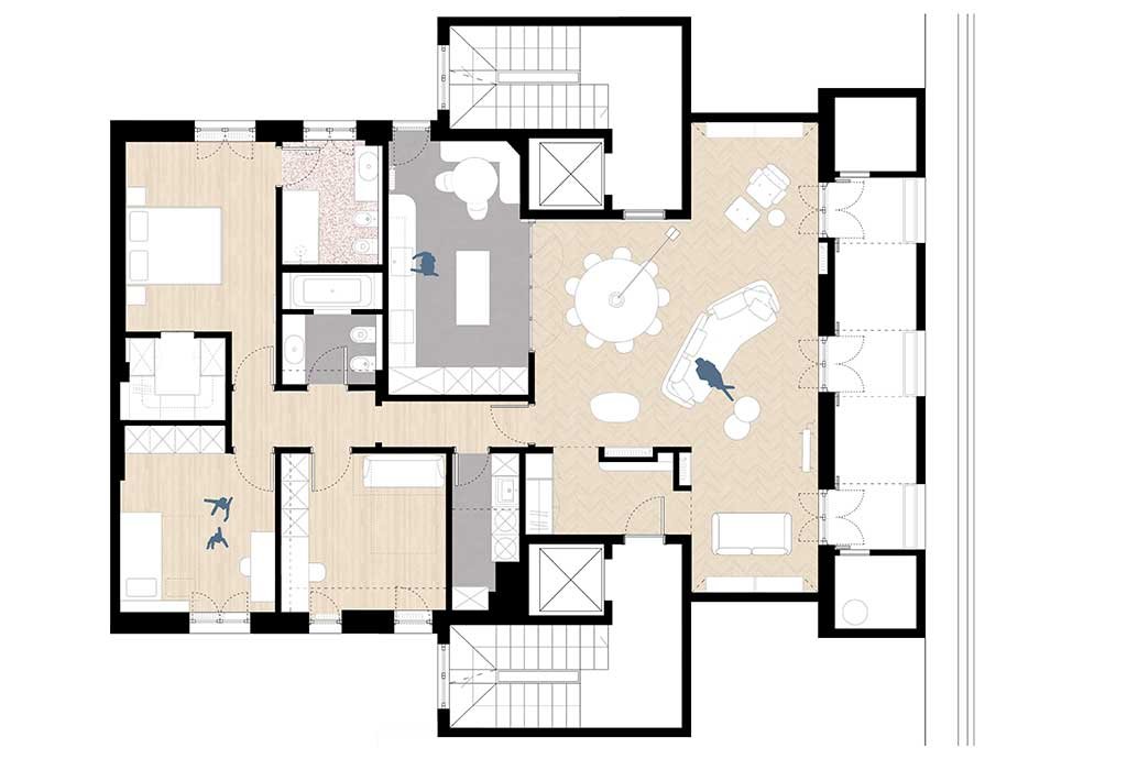
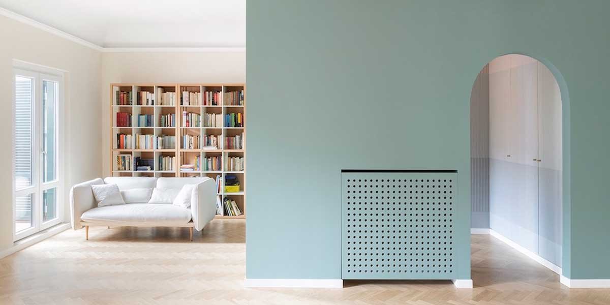
The entrance introduces to the living area and defines geometries and patterns that characterize the house.
The renovation project starts from the need for a new spatial distribution and renews the environments thanks to geometries, color palettes, and textures. Carefully studied materials and nuances constitute the architectural intervention, configuring as a connective tissue, and the new layout directly links the space to the furnishings.. The clients already owned some iconic design elements, which were paired with carefully studied furniture as definition and completion of the interiors.
The living room is ideally divided into different spaces, dedicated to conversation and reading.
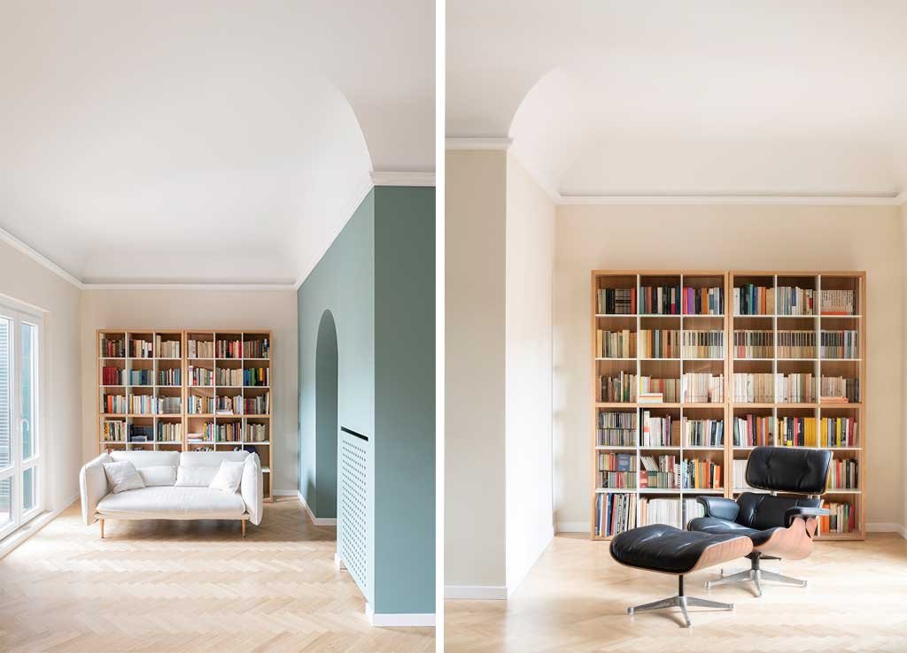
Inspired by the thought of Luigi Caccia Dominioni, who did not like direct entry into the living room – “because it does not reserve surprises” – the designers created a hallway space for the living area, which is glimpsed through two arched openings. The east-facing living room includes spaces for dining, reading, conversation, and music.
An elegant painted steel window separates the living area from the kitchen.
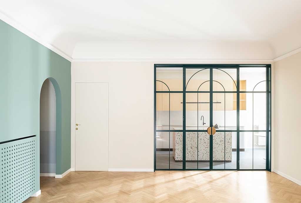
The kitchen, in visual continuity, is an environment that does not hide, separated by a large painted steel window in a geometric composition of arched designs. These graphic details coherently dialogue with the hues of the wallpaper in the entrance to the house, generating visual harmony. The project highlights the desire to evoke the history of objects and the house while contemporizing geometries with patterns and contemporary materials. This graphic and material presence enters the space discreetly, defining a very precise character: contemporary and refined, yet timeless.
The kitchen characterized by a monolithic island, overlooking the dining area of the living room, in a shared aesthetic dialogue.
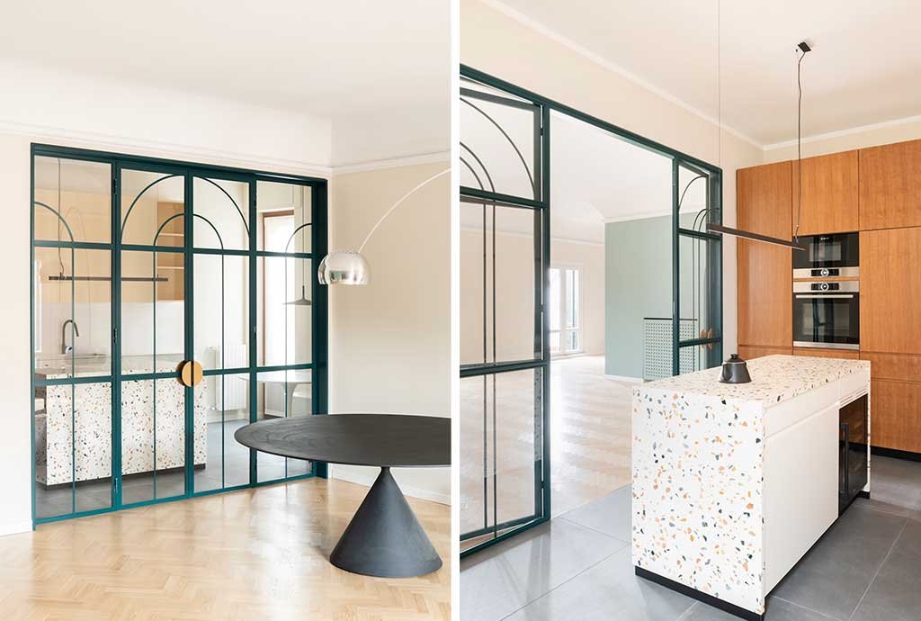
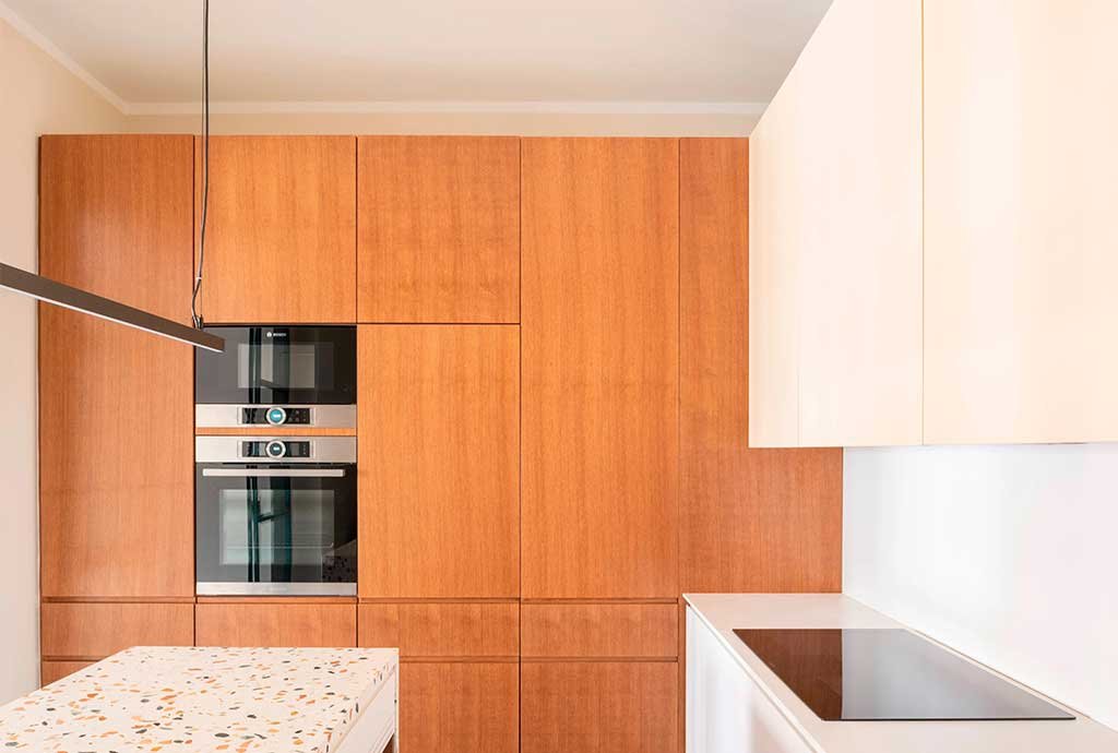
In this environment, each piece of furniture has a strong identity: the columns are in stained oak, the bases in white, the wall units in a delicate pale yellow. The central island recalls the tones of the elements that inhabit the space: it is made like a monolith in Venetian terrazzo, whose aggregates range from green (like the window) to pink to orange.
Functional and modern, the kitchen plays on the contrast of different materials, elegantly in pendant.
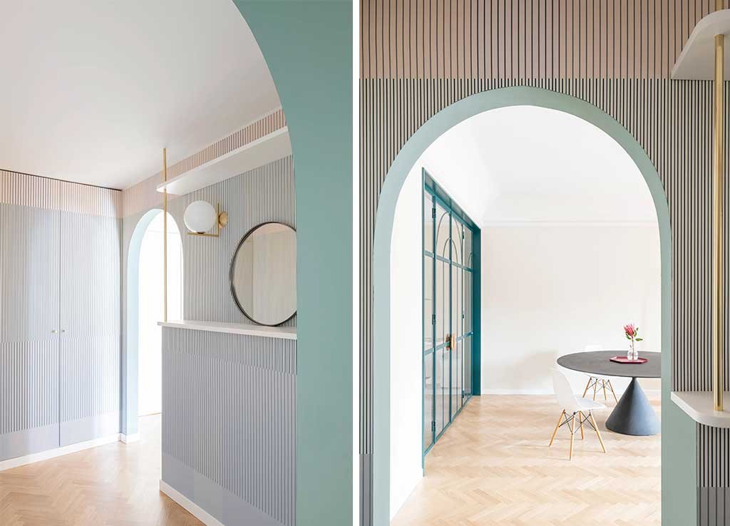
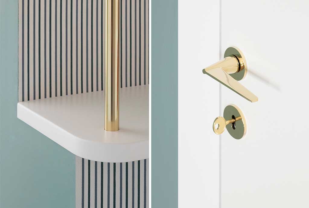
The renovation performs a cultured operation and therefore very effective. It dedicates care and attention to the use of color, dominant from the first space of the entrance: here the wallpaper recalls the wainscoting of the common areas of the condominium, establishing a relationship between the external space and the interior of the house and constituting a “filter environment” of welcome.
Brass details, such as the Cono handle designed by Gio Ponti, recall the Milanese architectural style of the post-war period, while the Anastassiades wall lamp recalls and updates the lighting of Milanese corridors. Choices capable of telling an aesthetic not only visually beautiful but also contextualized to the location.
The wallpaper of the entrance and its colors, in contrast to the brass details and the Cono handles designed by Gio Ponti.
The living room is separated from the sleeping area by a sliding door. Beyond this filter are two bedrooms, a study, two bathrooms, and a laundry room. The new distribution of the apartment has made the space of the whole house rational and more usable. The apartment is enlivened by the use of different shades and patterns but the designers’ ability to create references between the various elements makes the renovation coherent and the space continuous.
The master bedroom takes up the tones that can be admired from the panorama outside the windows.
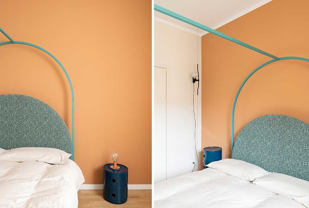
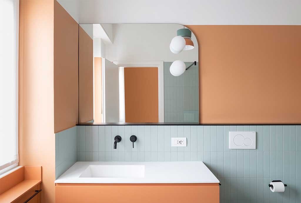
The chosen colors reflect the colors of the plaster and the roofs of that part of Milan that can be admired from the apartment’s windows. The bedrooms have personality in their essentiality, they are spaces of rest, of quiet, where time flows slowly. The bathrooms follow the color range of the house: red-terracotta terrazzo floors, green-gray pastel tiles, contrasting black graphic details, intimate and enveloping yellow-orange-blue hues.
For the master bathroom, the same hue as the bedroom was chosen, highlighted by the contrast with azure tiles and black profiles and fittings.
The second bathroom is played on tones of yellow, black, and gray and recalls the shape of the arch, a design symbol of the whole house.
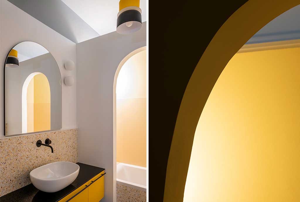
Arches return to these rooms as preferred geometric elements: they define passage areas and shape mirrors and furnishings. The effect is that of a warm and welcoming environment, made so also by soft geometries and the choice of design patterns that, delicately and with charm, give the project a harmonious and elegant appearance.
Project by PLUS ULTRA studio – plusultra-studio.com
Photo by Federico Villa.
The view over the rooftops of Milan from the house’s windows.

The floor plan of the apartment.