
by Claudia Schiera.
The question arises spontaneously every time you renovate or want to give a new allure to your home: what is the most suitable shade to choose? There are many factors to take into consideration, starting from your own tastes up to interior design.
We often think that studying a new color for the walls of the house is the most immediate and simple thing in the world, but this is not really the case. Bringing a new color into the home can radically change the face of that environment. If it were chosen with little care, it could create unlivable solutions and some small inconvenience or “disturbance” in everyday life, if not even ruin the general elegance of the entire environment.
Before preferring one shade over another, it is a good idea to carefully analyze the room you want to renovate as a whole, its dimensions, the height of the ceilings and evaluate the presence, or otherwise, of natural light coming from the windows. Without forgetting artificial night lighting, which creates other settings and chromatic atmospheres.
Pimento by Flamant – flamant.com

Having considered these “fundamental parameters“, you can move on to choosing one or more furnishing colours, considering your stylistic and aesthetic preferences, but also evaluating any benefits and negative effects that a nuance can give. In fact, it has now become a plus to paint not only the walls: doors, fixtures and ceilings are new canvases on which to experiment with refined contrasting or tone-on-tone pendants. In this vision, you need to create a color project tailored to your personality.
Perle by Flamant.
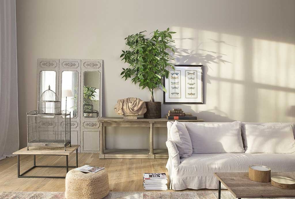
NEUTRAL AND PASTEL TONES
Focusing on neutral shades such as beige, sand, butter white and greige (a balanced combination of beige and light grey) is a “safe” choice for all environments and allows you to modify a home environment without any particular upheavals. Similar circumstance when you decide to insert a pastel shade, shades, among other things, which are back in fashion today.
Boho Cinnamon by Novacolor – novacolor.it

Masquerade 334; Light GoldTM 53; BlushTM 267. 22; MasqueradeTM 334; Light GoldTM 53; Invisible GreenTM 56 by Little Greene – littlegreene.com

From the most intense shades of pink, through the most velvety and dusty blues, up to soft tips of yellow, they are interior colors that guarantee aesthetic quality and great balance. In fact, they allow you to create fresh and balanced environments whatever the type of space available: small, large, more or less bright.
The neutral and pastel color palettes are perfect for areas dedicated to sleep and relaxation, but can also be inserted into living spaces and kitchens. The important thing is to always create combinations with furnishings and finishes that are distinctive and avoid overly affected mixes.
P835 of San Marco – san-marco.com

P848 by San Marco.

Wild Rosemary by Novacolor.

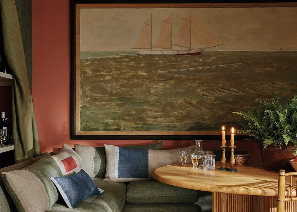
DARK NUANCES WITH CHARACTER
Everything changes if you decide to use the color on the wall as a real instrument of revolution by focusing on important dark and decisive shades. Slate grey, purple and burgundy, warm chocolate browns, ink blue and green, in the deep shades of the forest, are highly trendy shades that allow the creation of evocative furnishing solutions that ignite the senses.
Left, Sloe Blue n.87; on the right, Railing n.31 by Farrow Ball – farrow-ball.com

However, dark shades require a careful study of the environment, the light and the furnishings present, the new color must be inserted and become part of a unique and harmonious project. If the softer shades lend themselves to dressing both an entire room and one or more walls, in the case of saturated and dark shades it is better to study one or at most a couple of walls and avoid too much unscrupulousness, but with a good dose of rationality.
Only in truly minimal situations can one think of creating a “box effect” by painting all the surfaces, including the ceiling, creating a result with a certain visual impact, usually suitable for entrances, bathrooms and passageways. Or, perfect for recreating romantic settings of Victorian or yesteryear inspiration.
Hopper 297; CitrineTM 71; Dark Brunswick GreenTM 88 by Little Greene.

Balance and harmony are the two key words that must guide the choice of furnishing colours, beyond more or less temporary preferences and fashions. The new color choice within an environment should always provide a pleasant sensation and never be a disturbing element. Today, much more than in the past, when designing an environment, the color of the surfaces strongly defines the atmosphere and character of a home, to the point of placing the furnishings in a complementary position.
2024 AW Collection by Colefax and Fowler – colefax.com
On the cover, Royal Navy 257. SmaltTM 255 by Little Greene.